Saturday, April 2, 2011

Journal Entry 13: Clothing Typography

I chose this example because I like the type that was used. It gives that rocker style but with a more fancy twist. I like that it is in silver because it gives a shine and looks good over black leather. My initial reaction was that this tag added to the jeans in a way by giving it more quality.

I think that the copper color used for this font works well against the blue jean. I like how the 7 and the S are nearly the same height. I also like how the n crosses the 7, connecting the whole title together well. My initial reaction was that I liked the script & shape of it.

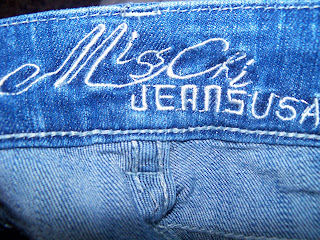
To me, this almost looks hand-stitched and it does not give off a neat, sharp look. I do not like how there are no spaces used between the words. There is not much change in weight and there is not a meaningful alignment for how the second line placement is.

These images were taken from my closet. I chose to do these because it is interesting to me how different designers vary in how fancy they get with their labels especially when they are just seen from the inside of the jeans. I feel that the type on any piece of clothing is important to look good and achieve the style it is shooting for because shoppers do consider small details when browsing through stores.

Journal Entry 12: Food Labels

All of the informational text on this box is centered and well-organized. I like how the icons were added next to the different flavors to be easy for viewers to correlate, however, I would have used more neutral colors to go with the rest of the design to represent Quaker. The other colors were chosen well as to not be repetitive. I think "instant oatmeal" could have been more bold or stand out more in some way. 

I think the type on this box works well for doughnuts. Since their name is Soft'ees, it makes sense that they used an organic, bubbly font. The white outline and blue gold around the red letters ties everything else on the box together. I think the placement was done well. My initial reaction was that I noticed the box because of the big red font, next I looked more and decided doughnuts sounded good. 

I think the type on this label could have been more creative. I would have used different colors and a different approach for the proximity.

I took these pictures in my kitchen.

Journal Entry 11: Collectable Signs

This tin collectable Coors sign caught my eye because of its antique-like style. Its company name is large and the main element, the line of text underneath was not meant to stand out or look as part of the name so it is in a fine, small, sans serif font.

A variety of different fonts are used on this sign. This works because they're in order of importance and still carry your eyes in the order they should see it. Pabst is italicized and fancy, Blue Ribbon has serifs giving it a professional effect, and beer is in capital letters but minimized in size to fit well into the ribbon.

This sign caught my eye because it is meant to be bold, clear, and simple. Everything is center-alligned and clean looking for passerby's.

I saw these signs in downtown Flagstaff. The 1st two were in Smoke and Bottle and the last sign was in the children game store.

Journal Entry 10: Skis


What attracted me to these skis were how their designs vary and how colorful they are overall. My favorite one when it comes to just type would be the Coyote one on the far right. I like the interesting font as well as the color combination of light blue on bright yellow.The script gives it a more mature look as well.

The ATOMIC ARC ski was interesting to me because the type technique looks more unique than I am used to seeing. It is interesting how they used off-white on white with a thin black outline so it could be noticed and legible. I think ARC was too slanted and tall.

The ski on the far right is interestingly connected. The K forms into a 2 in a clean way and is repeated into a pattern down the ski. I like how the gradient of the letter fades in opposite direction of the background so that the bright pink does not overlap. The type underneath that says USA is too different and I do not like how 2 completely different styles are so close. I would have chosen one or the other.

These skis are used as bench backs in the patio seating of a downtown restaurant on San Francisco Street.

Journal Entry 9: Tobacco Products


The 2 images above were interesting to me because of how similar the styles were done for both of these cigar boxes. I think the LaFlor Dominicana was more successful because of its font giving it a more fancy look, as well as the wood being a richer color. When it comes to cigars, people want the best quality, therefore I think design comes into play a lot when people are comparing brands.

Type & image give customers the biggest sense of what the product is like. When looking through multiple flavors, we look at the image and design before actually reading. With that said, I think the package on the far right is the most effective. It represents its flavor well and looks appealing. The type is also a good choice and isn't overdone. 

The package on the far right is most legible, the color scheme is most appealing, and overall the design describes the flavor well. 

I took these pictures in Smoke and Bottle. Initially, these were interesting to me because they were surrounded by so many options and that is when people naturally judge the presentation of the product.

Journal Entry 8: 3D Signs

I think the way the A is offset adds interest to this logo because otherwise it would look too boring. I think the space between Tom Alexander and Photography could be a little wider to add more separation. Another possible approach could be dividing the two lines with a dot on each side.

This sign is interesting to me because the letters are cut out and on a raised surface giving a shadow behind. I do not know if it was done intentionally, but I noticed that there is a correlation between the name "hidden lights" and the design. That is, the shadow beneath shows the text in negative almost lit, surrounded by shadows, and hidden by the copper material above it. I think if this was done intentionally it was very clever.


I found it interesting how differently these two beer companies approaches were in creating their design. Corona gives more of a "I'm on vacation" feel and they advertise that in their commercials with people relaxed on a beach opening a bottle of Corona. Because of this idea, their font is more laid back and the C looks almost spanish to correlate with Mexico. Bud Light is very American looking with the red, white, and blue color scheme. It is bold, strong and intended to be the all-American beer choice.

The first two photos were taken on the side of a building in downtown Flagstaff. The second two photos were taken from outside a restaurants window in downtown Flagstaff.

Journal Entry 7: Advertisements

The type on this poster looks disconnected from the top. The "Mad-I" fit in on the top left looks like it did not know where to go and throws off the symmetry. All together I think there could have been a better way to combine all the information with a similar color scheme.

I think the text area over the pickle is hard to read since the background color is similar to the color of the text. I think a brighter color would stand out better and be more legible. 

There is a lot of variation in fonts, size, and color. I think it still looks good because there is so much information that putting more emphasis on different areas makes it easier to read as a whole. 

I took these pictures of signs I saw standing on sidewalks in downtown Flagstaff.